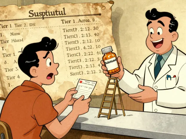
Have you ever picked up a pill bottle, seen a tiny sticker with a bold symbol, and wondered what the heck it means? You aren't alone. Those small warning labels on your medicine bottles aren't just decoration; they are critical safety signals designed to prevent accidents. In fact, misunderstanding a single icon could lead to serious health issues, and studies show that medication errors contribute to thousands of preventable hospitalizations every year. If you're reading this because you want to understand what those yellow or red stickers actually say, you've come to the right place.
We're going to break down exactly how these warning systems work, why colors matter, and where you might get confused. We'll look at real-world data showing how often patients misunderstand these symbols and what you can do to stay safe when picking up your next prescription. By the end, you'll know exactly which warnings demand your immediate attention and which ones are helpful reminders. Let's clear up the confusion once and for all.
What Are Pharmacy Warning Icons?
Pharmacy Warning Icons are standardized visual elements placed on medication containers. They function as quick-reference guides for critical safety information. Also known as Cautionary Advisory Labels (CALs), these stickers communicate vital details about side effects, administration rules, and interactions without requiring you to read pages of text.
They were developed largely through collaborations between pharmacy associations and safety organizations. Groups like the Institute for Safe Medication Practices (ISMP) have pushed for their standardization since the 1990s. While they seem simple, their goal is high stakes: preventing adverse drug events. According to the FDA, medication errors are a significant safety concern, and these labels are meant to act as a final checkpoint before you take a dose.
The core value here is speed and clarity. You shouldn't need a degree in chemistry to know if a medicine makes you drowsy. These icons bridge that gap. However, current reports indicate that while about 90% of prescription containers in the U.S. feature these warnings, comprehension remains a challenge. That's why understanding the system is just as important as having the label there.
The Language of Colors on Labels
You might notice that not all warning stickers are the same color. This isn't random; pharmacies often use color-coding to help group different types of risks. For instance, in many systems:
- Yellow labels typically signal sedative properties or warnings about driving.
- Tan labels often point to anti-infectives or antibiotics.
- Red labels usually indicate urgent dangers or severe contraindications.
- Blue or Green labels might represent recommendations rather than strict prohibitions.
Research from 2019 published in U.S. Pharmacist highlighted a crucial detail: 42% of patients naturally associate red with "danger" and yellow with "caution." While our intuition helps, the actual meaning depends on the pharmacy's specific coding policy. Unfortunately, confusion still happens. The U.S. Pharmacopeia-ISMP Medication Errors Reporting Program documented over 120 incidents between 2015 and 2020 where staff or patients confused the color categories, leading to potential misuse.
This means you cannot rely on color alone. You must read the text accompanying the icon. Relying solely on the color might give you a false sense of security, thinking a yellow label is less dangerous than it really is when, in fact, some yellow warnings involve life-safety issues like drowsiness affecting machinery operation.
Common Symbols and Their Real Meanings
Some icons are straightforward, but others are deceptively tricky. Here are the most frequent symbols you'll encounter and what you actually need to watch out for:
| Symbol Description | Correct Interpretation | Common Misunderstanding |
|---|---|---|
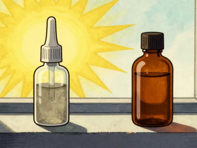
| Dropper Eye Icon | For eye use only | Often mistaken for oral liquid drops |
| Mouth/Lip Symbol | Do not chew or crush | Sometimes read as "do not swallow whole" |
| Alcohol Glass | Avoid alcohol consumption | Assumed to apply only to painkillers |
| Sleeping Figure | Drowsiness alert | Patients ignore the machinery warning |
Take the "Eye" symbol as a prime example. There was a real reported case where a mother accidentally swallowed her eye drops because she mistook the dropper icon for oral administration. It sounds extreme, but it highlights how non-intuitive some of these visuals are. Similarly, the instruction "Do not chew or crush" was misunderstood by nearly 60% of patients in one study, who thought it meant "swallow quickly" rather than "keep the capsule intact." These specific interpretations matter because breaking a tablet can release medication too fast, causing toxicity.
Another major category involves dietary restrictions. Many people assume alcohol warnings only apply to heavy drinkers. The reality is that even a single drink can interact dangerously with certain antibiotics or blood pressure medications. The icons try to catch this, but without counseling, many patients skip this advice entirely.
Regional Differences: US vs UK vs New Zealand
If you travel frequently, you might notice that pharmacy labels look slightly different depending on where you are. Standardization hasn't happened globally yet, which creates variation.
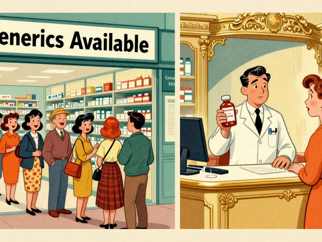
In the United States, the system is fragmented. Major chains like CVS Health and Walgreens have their own sets of icons-roughly 14 to 17 distinct warnings per chain. Independent pharmacies might use even more. This lack of national consistency has been criticized by experts like Dr. Robert Field, who noted that the differences create inconsistencies across the massive $576 billion U.S. prescription market.
In contrast, the United Kingdom uses a nationally standardized system overseen by the Medicines and Healthcare products Regulatory Agency (MHRA). Since 2015, the UK adopted nine specific warning labels. Data shows this reduced misinterpretation rates significantly, dropping from 39% to just 17%. This suggests that uniformity works.
New Zealand offers another interesting model using Cautionary and Advisory Labels (CALs). Implemented nationally around 2018, their system showed 22% better patient comprehension compared to older U.S. methods. Their approach emphasizes small, bright yellow stickers that stand out clearly against white packaging. When comparing these three systems, the clear winner for patient safety is the one that prioritizes fewer, clearer, and nationally mandated symbols.
Risks of Misinterpretation and Error Statistics
Why does understanding these icons matter so much? Because misreading a label is a form of medical error. The FDA identifies medication errors as contributing to at least 7,000 deaths annually in the U.S. alone. While pharmacy warnings aim to stop this, they are not perfect shields.
Dr. Michael Cohen, President of ISMP, emphasized that "Standardized warning labels are necessary but insufficient without proper patient counseling." Research backs this up: simply putting a sticker on the bottle only improves comprehension by a fraction if you don't talk about it. Studies show that when verbal explanations accompany visual symbols, understanding jumps by over 60%.
There is also the issue of "alert fatigue." If a bottle is covered in five different stickers, patients tend to tune them out. A survey found that 63% of respondents felt there were "too many labels creating clutter." This leads to the most dangerous scenario: ignoring the one warning that matters most. For example, on sedating medications, misinterpreting "Do not operate heavy machinery" led to dozens of motor vehicle accidents. That specific warning failed because patients believed they understood it, or they didn't realize it applied to everyday driving.
How to Read Your Medication Label Correctly
So, how do you navigate this effectively as a patient? Here are practical steps to take when you pick up a new prescription:
- Check the text first, then the icon. Don't assume you know what the picture means. Read the accompanying sentence to confirm your guess.
- Ask the pharmacist to point out the top three risks. Wording matters. Ask, "What are the main things I need to watch out for with this specific box?" This filters out the clutter.
- Verify the color code. Know that red usually means stop/caution, but always check the wording below it to be sure.
- Look for QR codes. Many modern pharmacies in 2026 now include scannable codes linked to video explanations. If you can access them, watching a 30-second video is often safer than guessing.
- Keep old boxes away from new ones. Never swap a new prescription into an old container just because the shape fits. Old containers might have outdated warning stickers.
Also, pay special attention to language barriers. The FDA notes that symbols transcend language, which is great, but cultural interpretation varies. For instance, a "radioactive" symbol used for "external use only" was misinterpreted by nearly 70% of people with limited health literacy in one study. Assuming the symbol is "universal" is a mistake you can avoid by asking for translation if needed.
Frequently Asked Questions
What should I do if I don't understand a warning label?
If you are unsure about any symbol or text on your bottle, ask the pharmacist immediately before leaving the counter. Do not guess. They are required to explain the label meanings to ensure your safety.
Do warning labels differ by pharmacy brand?
Yes, in the United States, chains like CVS and Walgreens use different proprietary systems (e.g., 14 vs 17 labels). Community pharmacies may vary further. In the UK and New Zealand, the systems are more nationally standardized.
Are digital labels replacing physical stickers?
Not entirely. While many pharmacies use QR codes for extra information, physical stickers remain mandatory under FDA guidelines for critical warnings due to accessibility laws covering seniors and low-tech users.
What is the most commonly misunderstood warning?
The "Do not chew or crush" instruction is frequently misunderstood. Almost half of patients misinterpret it, sometimes thinking it refers to swallowing speed rather than tablet integrity, which changes the drug's dosage delivery.
When are new labeling standards coming out?
New federal guidelines proposed in late 2022 aimed for full implementation by 2026. As of March 2026, major chains are aligning with a standardized set of 12 core icons to reduce confusion.


Many people ignore the actual regulatory framework behind these labels and focus solely on the aesthetics.
The ISMP guidelines were drafted without full consensus from every regional board involved.
You would find that the color codes vary significantly between states despite the claims made in the article.
It is frustrating to see such basic oversight ignored by casual observers.
This issue requires much deeper analysis than what was provided here.
Oh wow I really appreciate that you brought up the different systems around the world because it helps put things into perspective.
My aunt had trouble last year when she traveled and got confused by the sticker colors on her blood pressure meds.
She thought the yellow meant something completely different than what the local pharmacist intended.
It took forever for her to figure out that drowsiness warnings looked totally unique abroad.
I remember calling her pharmacy constantly to try and get the right translations for the symbols printed on the box.
Sometimes I feel like the doctors explain too little during the pickup process at the counter.
We need way more support from staff to read through those tiny texts clearly with us.
It makes sense that verbal confirmation is better than just staring at a graphic alone.
Seeing how many accidents happened in the report was genuinely scary for me personally.
I wish they could make the fonts bigger so people with vision issues don't miss the details easily.
It really takes a village to keep patients safe with all these complex warning signs everywhere.
Your breakdown helped me understand why consistency matters so much for everyone involved.
I am glad someone wrote this because my mom gets lost looking at her bottles daily.
Maybe the new standards coming in 2026 will finally fix all the mess we are dealing with right now.
Until then we should always double check with the person handing us the medicine.
They paint the bottle in neon hues to condition your brain into submission.
It is a subtle tactic designed to bypass critical thinking faculties entirely.
Corporate interests dictate the palette to ensure maximum compliance from the masses.
People simply refuse to take responsibility for their own health choices!!!
It is utterly unacceptable to ignore safety protocols due to inconvenience!!
Everyone should prioritize reading the fine print regardless of how busy life becomes!!!!!
The implementation of standardized labeling protocols is essential for patient safety outcomes.
Regulatory bodies have identified clear metrics to evaluate comprehension rates effectively.
Misinterpretation statistics suggest a significant gap exists between design and application.
Continued education remains a critical component of the solution strategy.
We must prioritize clarity above aesthetic considerations in future revisions.
Another day another label nobody reads until it is too late.
Clarity emerges when chaos is reduced to its simplest necessary forms.
Honestly the whole situation feels like a test of intelligence 🤦♀️.
People complain but rarely actually look at the stickers 👁️.
Safety is great but convenience rules the day 😩.
Why bother trying to improve the system when humans fail anyway 🤷♂️.
Stop acting helpless because the system is flawed and start demanding change immediately!!!
We can overcome these barriers if we push hard enough to get results!!
Ignoring the problem will only lead to more preventable deaths eventually!!!!